
Brand guidelines
OET Brand guidelines
Colour
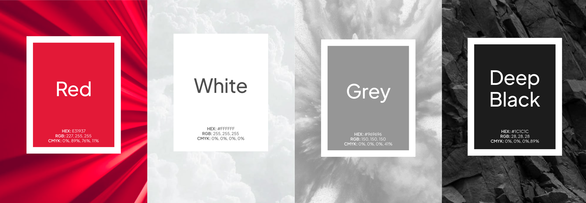
Colour is a defining element of the OET brand. Consistent application of our primary palette strengthens recognition and ensures that every communication feels cohesive, credible and distinctly OET.
Red sits at the heart of the palette. As a colour that is uncommon within our industry, it gives OET a bold and instantly recognisable presence, helping the brand stand apart from more conventional competitors. It conveys confidence, energy and progress, and should be used purposefully to highlight key messages and create moments of emphasis.
White, Grey and Deep Black provide balance and versatility. White and Grey create an open, calm and contemporary foundation, while Deep Black adds contrast, clarity and structure. Together, these neutral tones allow OET Red to remain distinctive and impactful across digital and printed applications.
Our primary colour palette consists of four colours:
| Colour | HEX | RGB | CMYK | Pantone or print guidance |
|---|---|---|---|---|
| OET Red | #E31937 | 227, 25, 55 | 0%, 80%, 100%, 0% | Pantone 186 C |
| White | #FFFFFF | 255, 255, 255 | 0%, 0%, 0%, 0% | Not applicable. Use paper white. |
| Grey | #969696 | 150, 150, 150 | Approximately 0%, 0%, 0%, 41% | Not applicable. Use a 41% black process tint. |
| Deep Black | #1C1C1C | 28, 28, 28 | 0%, 0%, 0%, 89% | Not applicable. Use a 90% black process tint. |
Colour balance
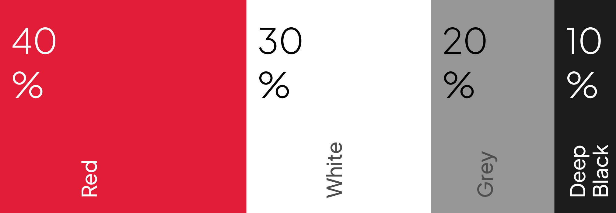
Colour proportions are essential to maintaining the right visual tone. Too much Deep Black can make communications feel heavy or overly serious, while too much Red can feel intense and visually overwhelming.
As a general guide:
| Colour | Suggested proportion |
|---|---|
| OET Red | 40% |
| White | 30% |
| Grey | 20% |
| Deep Black | 10% |
This is not a rigid formula. Red may occupy a larger area in high impact communications, such as social media graphics, while photography may replace part of the neutral area in editorial and web layouts.
Deep Black should be used more selectively, primarily for typography, outlines and structural elements.
Red gradients
Developed from OET’s photographic treatment, red gradients add depth, warmth and energy to compositions. They may be applied over photography or used on White backgrounds, always remaining within the OET Red tonal family and maintaining clear contrast and legibility.
Typography
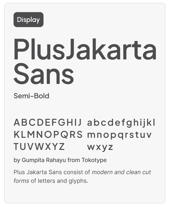
Typography creates a memorable brand impression and is essential to communicating the brand’s distinctive identity.
Plus Jakarta Sans is OET’s primary typeface. Its clean, geometric construction reflects the precision, structure and forward thinking character of the brand. Circular forms, balanced proportions and clearly defined letterforms give the typeface a confident and contemporary appearance, while its softer details retain a sense of warmth and approachability.
Our sans-serif typeface unifies our messaging, creating an image that is reliable, professional and approachable.
Logo
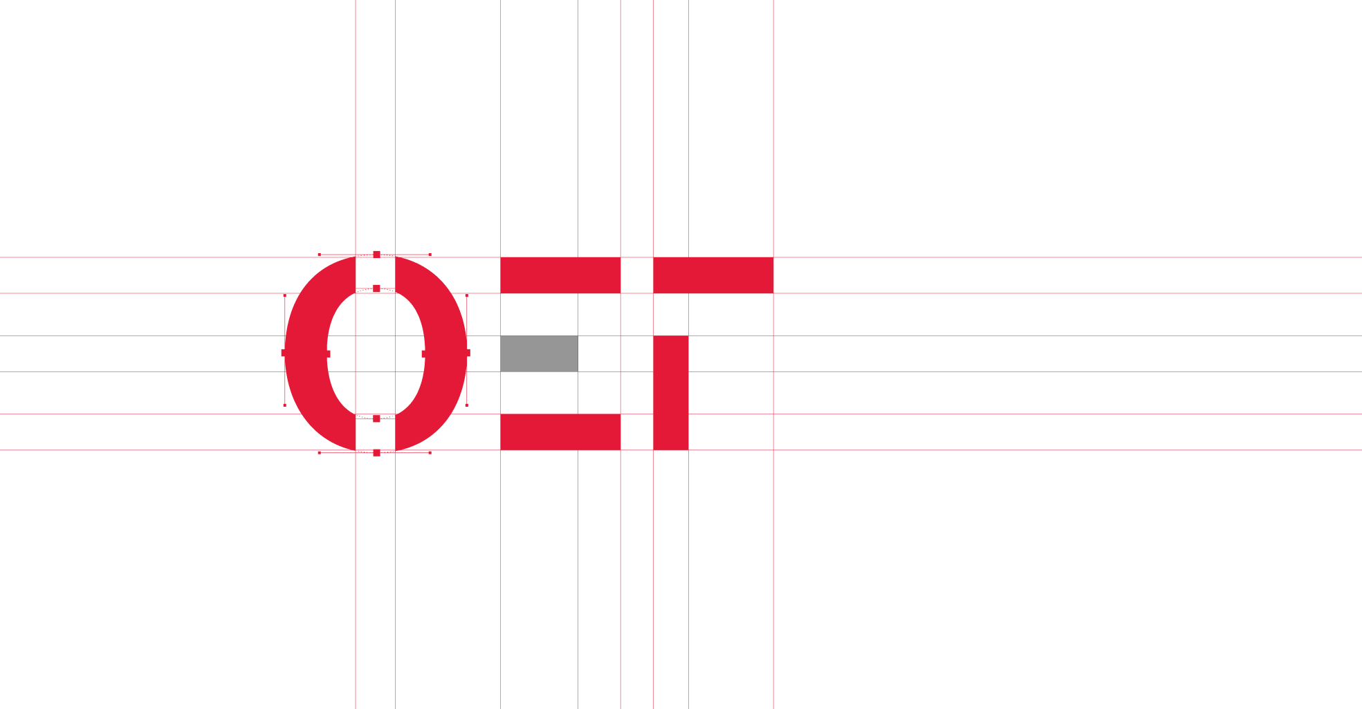
The OET logo is a bold and distinctive expression of our identity. Built from a modular system of geometric forms, its structured composition reflects the clarity, precision and technical thinking that define OET.
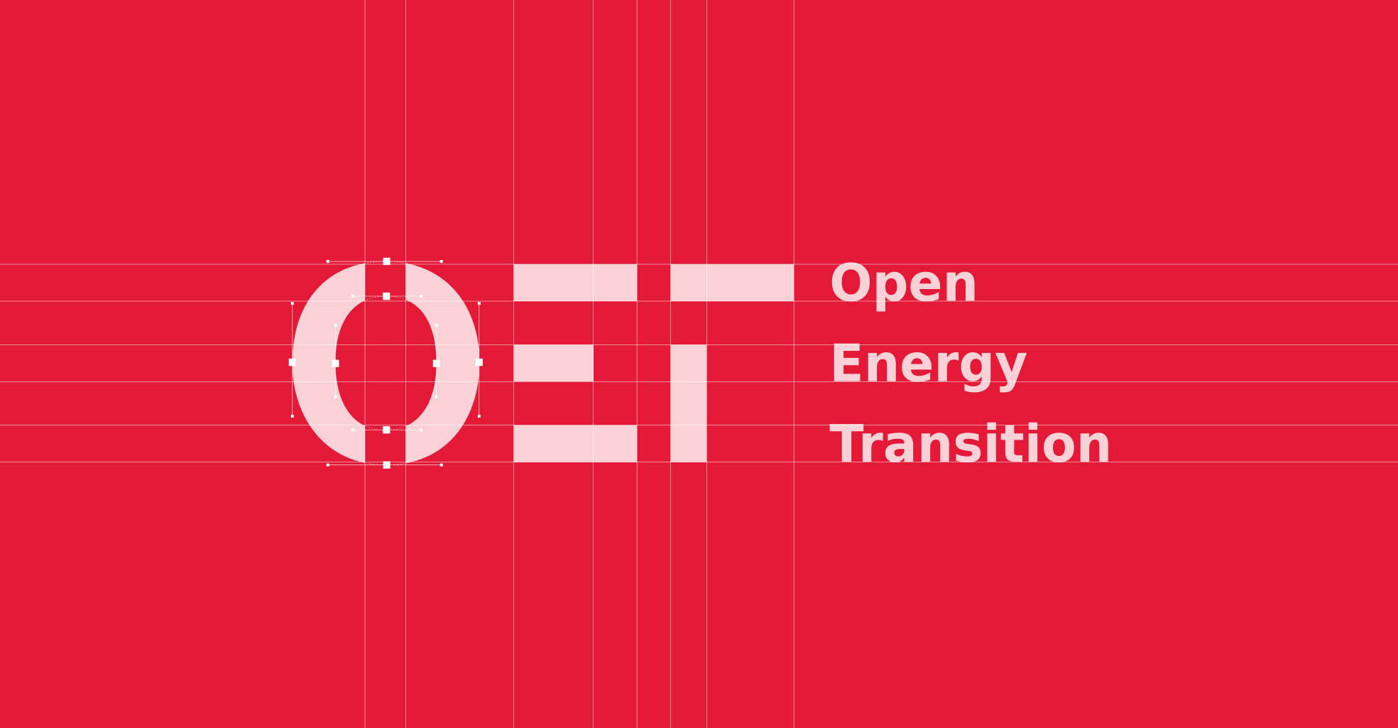
The OET symbol may also be used without the full organisation name when space is limited or the brand is already clearly identified.
The original OET logo was created in Python by Martha Frysztacki. Its code construction connects the logo to the digital tools, experimentation and technical thinking at the heart of OET.
Logo colours
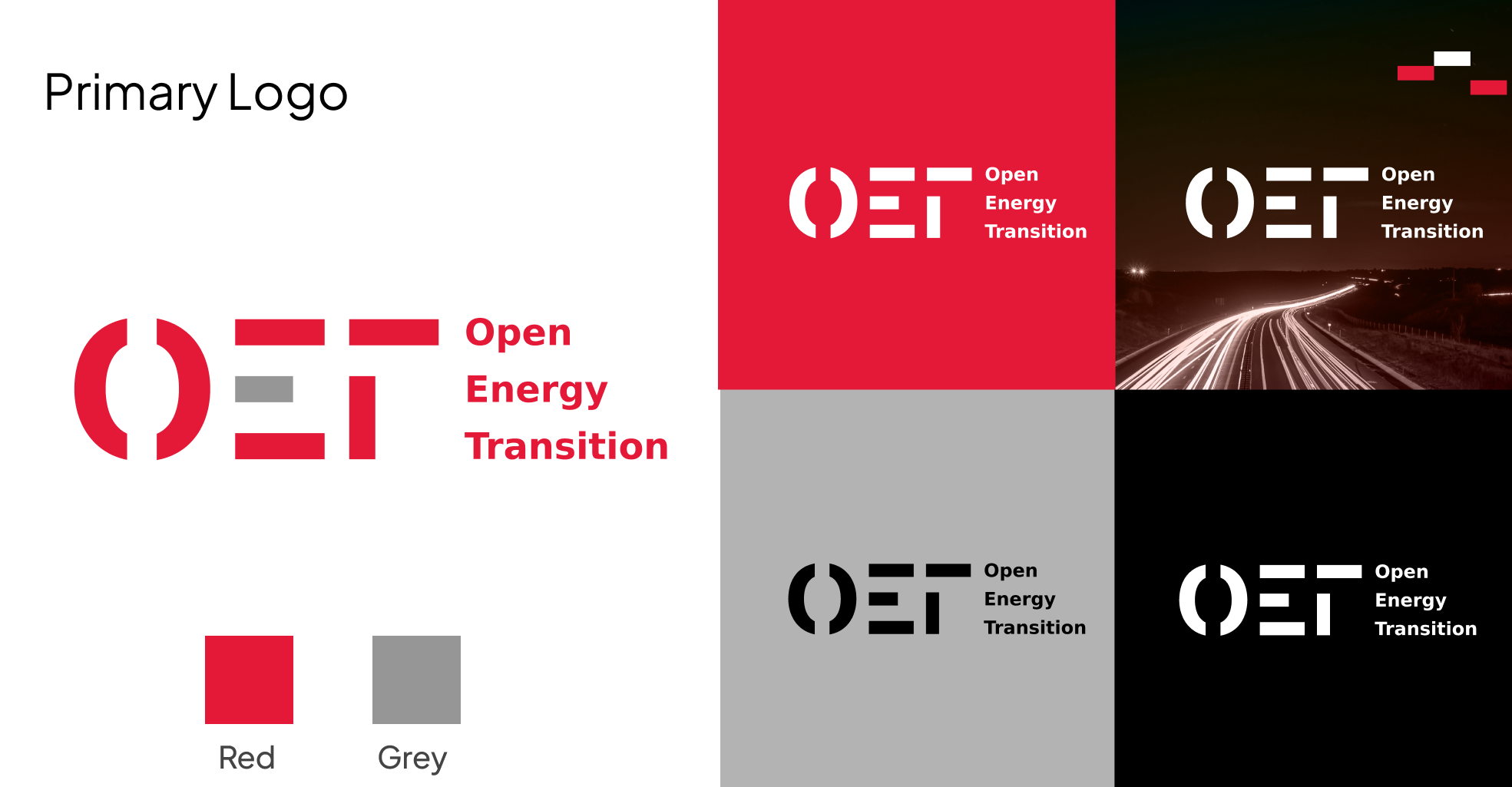
Always select the approved logo variant that provides the greatest possible contrast with its background.
| Background | Approved logo variant |
|---|---|
| White or other light backgrounds | OET Primary Logo |
| Grey backgrounds | Deep Black logo |
| OET Red backgrounds | White logo |
| Deep Black backgrounds | White logo |
| Dark photographic backgrounds | White logo |
On Grey backgrounds, use the Deep Black logo, as neither Red nor White provides sufficient contrast.
When placing the logo over photography, choose a clean and visually consistent area, avoiding detailed or low contrast backgrounds.
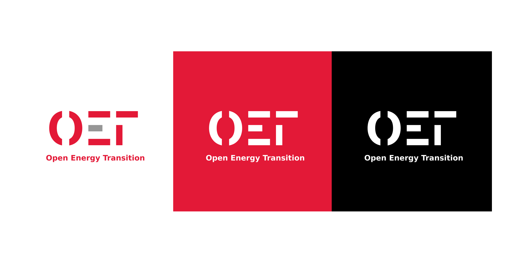
Vertical logo variant
The vertical logo is designed for narrow or compact spaces where the primary horizontal version does not fit comfortably. It retains the full OET identity in a balanced, space efficient arrangement and should always be used in its approved proportions.
Photography
OET photography should feel authentic, expressive and emotionally engaging. Every image should reflect our voice: professional, direct, helpful, collaborative and trusted.
Photography should always appear in colour, never greyscale. Warm tones, subtle duotone treatments and tactile textures are encouraged, with light grain or noise adding the character and warmth of analogue photography.
Energy can be made visible through light trails, flashes, sparks and dynamic movement, bringing a sense of momentum and optimism to every image.

Collages
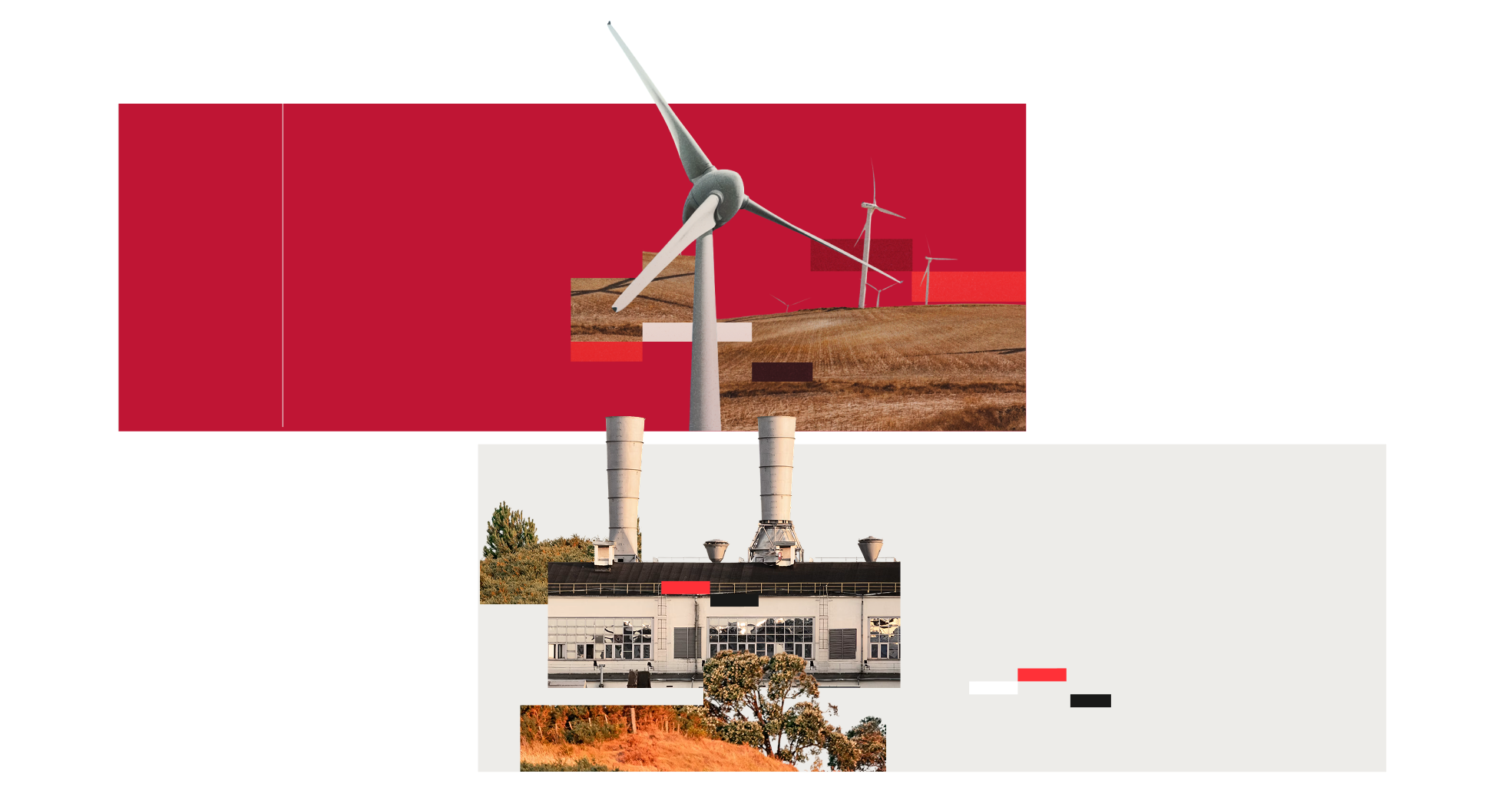
OET collages combine photography and graphic elements to create dynamic compositions that communicate the scale, complexity and human dimension of the energy transition.
Large rectangular image blocks draw from the proportions of the middle bar of the “E”, creating a clear visual connection to the OET logo.
These blocks are supported by carefully selected cutout elements without backgrounds, such as people, infrastructure and objects related to energy and industry.
OET Red should remain the primary accent, complemented by warm tones and the established photographic treatment. Subtle grain, texture and tonal adjustments may be applied to give the composition a cohesive, tactile quality.
Illustrations
OET illustrations use an isometric perspective to translate complex ideas, systems and abstract concepts into clear and accessible visual narratives.
Unlike our photography, illustrations are predominantly greyscale, with colour used selectively to create emphasis, communicate meaning and guide the viewer’s attention.

Elements are defined by clean black outlines, giving the illustrations a consistent, structured appearance. When people are represented, they should take the form of simple pictographic figures.
This minimal visual language keeps compositions easy to understand while allowing sophisticated ideas to be communicated in a direct and engaging way.
Illustration colour palette
OET Red is the primary accent colour. A limited range of functional colours may be introduced where context requires it. These colours should remain purposeful and secondary rather than decorative.
This is the suggested colour palette for illustrations:
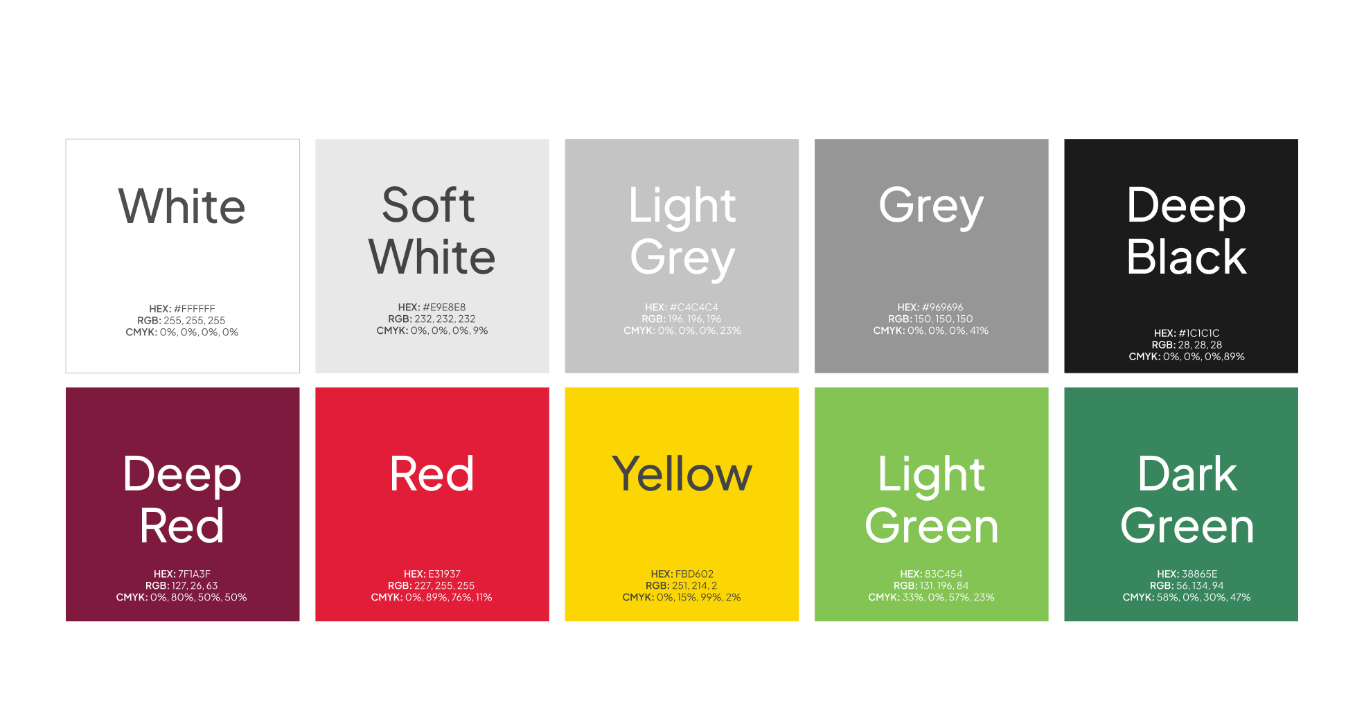
| Colour | HEX | RGB | CMYK |
|---|---|---|---|
| OET Red | #E31937 | 227, 25, 55 | 0%, 80%, 100%, 0% |
| Deep Red | #7F1A3F | 127, 26, 63 | 0%, 80%, 50%, 50% |
| Yellow | #FBD602 | 251, 214, 2 | 0%, 15%, 99%, 2% |
| Light Green | #83C454 | 131, 196, 84 | 33%, 0%, 57%, 23% |
| Dark Green | #38865E | 56, 134, 94 | 58%, 0%, 30%, 47% |
| White | #FFFFFF | 255, 255, 255 | 0%, 0%, 0%, 0% |
| Soft White | #E9E8E8 | 233, 232, 232 | 0%, 0.4%, 0.4%, 8.6% |
| Light Grey | #C4C4C4 | 196, 196, 196 | Approximately 0%, 0%, 0%, 23% |
| Grey | #969696 | 150, 150, 150 | Approximately 0%, 0%, 0%, 41% |
| Deep Black | #1C1C1C | 28, 28, 28 | 0%, 0%, 0%, 89% |
For Deep Black, use a 90% black process tint when printing.
Icons
Premium designed icons for use in web, iOS, Android and desktop apps. Completely open source, MIT licensed and built by Ionic.
This icon collection is selected for its visual similarity to our logotype, creating a unified visual language.
Icon licences
Icons used within OET digital products are obtained under UIcons’ open licence.
In general, UIcons are licensed by Freepik Ltd. and can be used for free, but they require mandatory attribution.
Supergraphics
Supergraphics are graphic devices used as key visual identifiers for the brand. OET has a pattern and a motif.
The OET pattern
Taken from the visual language of OET’s logo, this supergraphic is developed to resemble specks of energy or coding in motion.
The pattern combines the OET logo with a series of rectangles arranged through a structured grid. These rectangles share the same proportions as the middle bar of the “E”, creating a cohesive graphic resource that can be repeated and used as a distinctive texture across different applications.

The energy trail motif
Also taken from the middle bar of the “E” in the OET logo, the energy trail is a minimal expression of the OET pattern. Its sequence of rectangles suggests energy, direction and movement while retaining a clear connection to the brand.
The motif can adapt to different formats, including social media, presentations and other communications. It may contain between two and five rectangles and does not need to follow one fixed configuration.
The rectangles can appear in OET Red, Grey, White or Deep Black, depending on the background and application.

Branding shapes the whole journey
Strong brand guidelines give everyone at OET a shared way to communicate who we are and why our work matters.
Consistency across every touchpoint builds recognition and trust. When people understand and trust OET, they are more likely to engage with the products we build.